
Design Guides
Two-Tone Kitchens in 2026: Everything You Need to Know
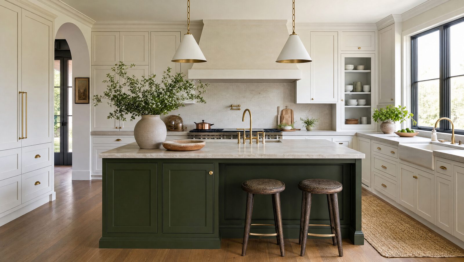
A two-tone kitchen used to mean one bold rule: paint the island a different color than everything else. In 2026, it's grown into a real design technique, not a trend to copy — and getting it right takes more thought than picking two colors you like. Here's what's actually working, and how to avoid the two-tone kitchen that looks accidental.
What color combinations are actually working in 2026?
The leading 2026 palette pairs warm “new neutrals” — cream, warm white, mushroom, warm stone — with deeper greens, inky blues, and soft blacks (The Coolist, 2026). The era of stark white-and-gray two-tone has given way to warmer, more grounded pairings.
Specific combinations doing the most work right now: white uppers with soft grey lowers, deep navy with clean white, warm wood with matte black, and sage green with creamy off-white (Home Depot, 2026). Rich green — forest or olive — paired with natural wood is the standout for an organic, earthy feel.
| Combination | Feel |
|---|---|
| White uppers + soft grey lowers | Classic, safe, resells well |
| Deep navy + clean white | Crisp, tailored, high contrast |
| Warm wood + matte black | Grounded, modern |
| Sage green + creamy off-white | Soft, organic |
| Forest/olive green + natural wood | Earthy, warm, distinctive |
Source: The Coolist & Home Depot, 2026.
Should the lighter or darker color go on top?
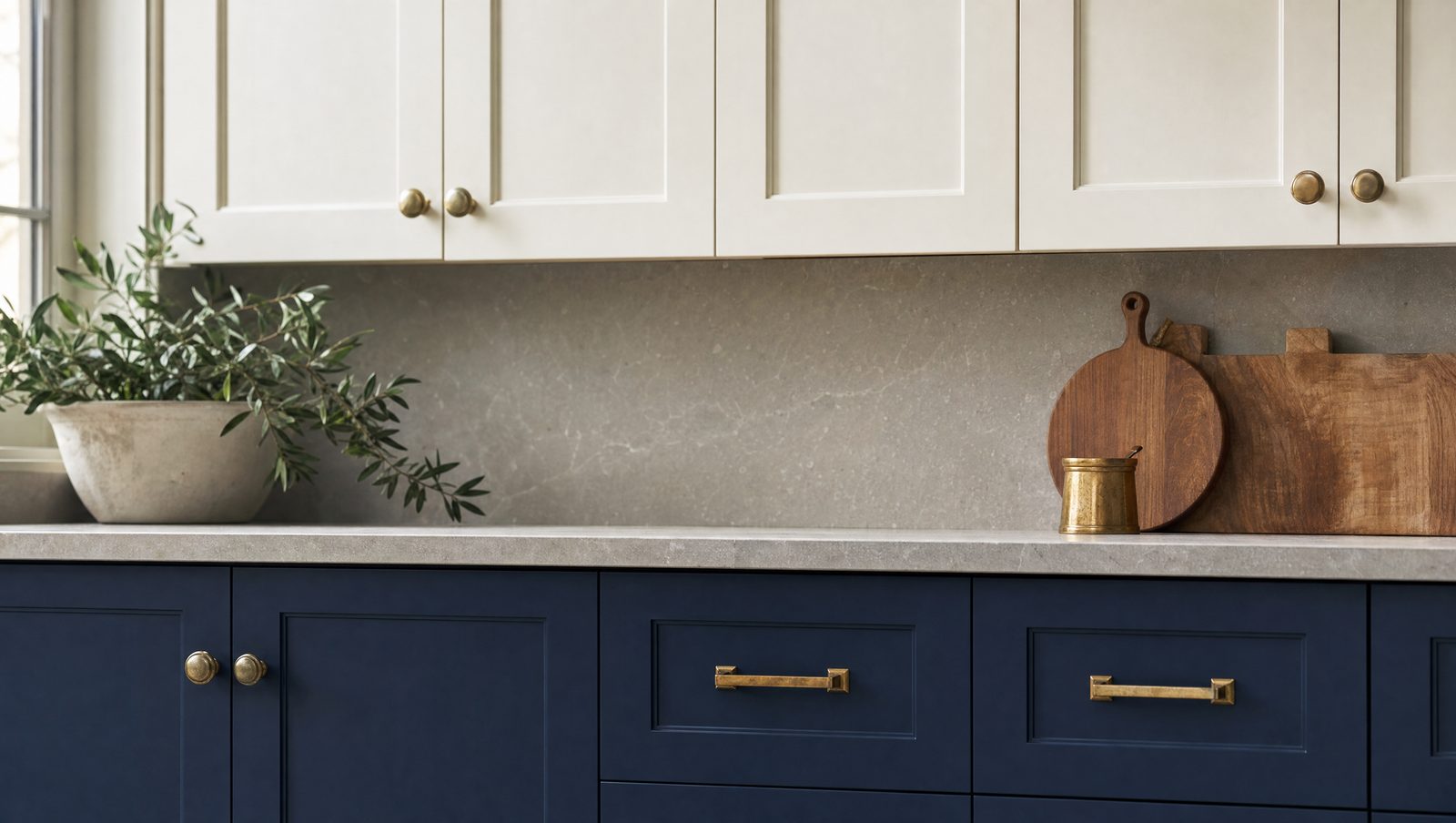
Put the lighter color on the upper cabinets and the darker tone on the lowers — it keeps the room feeling bright and airy while the darker base grounds the design (Grace House Studio, 2026). Flip it and the kitchen can feel heavy or top-lit in a way that fights the room's natural light.
This isn't a strict rule, but it's the default for good reason: light rises visually, dark grounds. Break it deliberately — for a moody, dramatic kitchen with dark uppers — rather than by accident.
Does the island have to match either color?
No — and in 2026, it often shouldn't. A warm white or natural-wood perimeter with a deep navy, forest green, or charcoal island remains one of the freshest combinations, delivering real visual impact without the whole kitchen carrying the contrast (Grace House Studio, 2026).
This is the lowest-risk way to try two-tone. The island becomes a third color — a focal point — while the perimeter stays calm and resells easily. It's also the easiest to update later if your taste shifts, since it's one cabinet run rather than the whole kitchen.
Our finding: the two-tone kitchens that hold up best five years later are the ones where the second color does a job — the island as a landing spot, the lowers grounding an open-plan room — not just “two colors because it's trending.” Ask what the second tone is for before you pick it.
How do you avoid a two-tone kitchen that looks like a mistake?
The failure mode is almost always the same: two colors chosen because they're both liked, not because they relate to each other. The successful combinations above share a logic — one warm neutral, one grounded or saturated tone, and a clear rule for which goes where.
Finish matters as much as color. A glossy finish reflects light and reads modern; a matte finish gives a softer, more contemporary feel (Home Depot, 2026). Mixing a gloss and a matte across your two tones can look unintentional — pick one finish family and stay in it.
Is two-tone right for every kitchen?
Not automatically. A smaller kitchen can absorb an island-only accent easily, but a full two-tone treatment on every wall risks feeling busy in a tight footprint. In an open-concept space, two-tone can help define the kitchen zone against an adjoining living area — which is exactly the kind of layout decision worth planning alongside the cabinetry, not after it. If you're weighing that kind of layout change, see our guide to renovation vs. remodel to understand what that scope actually involves.
The other honest answer: pick colors you can commit to. Trend-driven pairings age fastest; combinations chosen because they suit the room's light, your other finishes, and your own taste tend to outlast the year they were installed in.
Frequently asked questions
What is the most popular two-tone kitchen color combination in 2026?
Warm white or natural wood on the perimeter with a bold island in navy, forest green, or charcoal is one of the most enduring combinations (Grace House Studio, 2026). It delivers contrast without requiring the whole kitchen to carry it.
Should upper or lower cabinets be the darker color?
Lower cabinets, as the general rule — it keeps the room feeling bright while the darker base grounds the design (Grace House Studio, 2026). Reversing it is possible but should be a deliberate choice, not a default.
Are two-tone kitchens still in style in 2026?
Yes, but the approach has matured — 2026 combinations lean warmer and more considered than the stark contrasts of a few years ago (The Coolist, 2026). It is treated as a design technique now, not a trend to copy exactly.
Can you mix matte and glossy finishes in a two-tone kitchen?
It is possible but risky — mismatched finishes can read as unintentional (Home Depot, 2026). Most successful two-tone kitchens commit to one finish family across both colors.
Is two-tone a good choice for a small kitchen?
An island-only accent works well in a small kitchen, while a full two-tone treatment across every wall can feel busy in a tight footprint. Scale the contrast to the size of the room.
The bottom line
Two-tone in 2026 means warm neutrals paired with a grounded or saturated second color, lighter up top and darker below, with the island as the easiest place to take a risk. Treat it as a design decision that answers a question about your kitchen — not a trend applied because it's popular this year.
Book a design consultation and we'll find the combination that's right for your space.